
An amor fati tattoo is often chosen as a reminder to meet life with openness rather than wishing every part of the past away. The Latin phrase is commonly translated as “love of fate” and is strongly associated with Friedrich Nietzsche, but people bring their own meaning to it. These 25 designs explore lettering, flowers, animals, and placement while keeping the phrase central.
Before choosing a font or symbol, understand the idea you want the tattoo to express. Amor fati is not simply a promise that every painful experience is good, and it should not be used to tell someone to tolerate harm. For many readers, it is a personal practice of affirming life as it has unfolded while still making choices in the present.
What Does Amor Fati Mean?
The phrase is usually rendered in English as “love of fate.” Nietzsche uses it in section 276 of The Gay Science, where he writes about learning to see what is necessary in things as beautiful. His later work returns to the phrase. Scholars discuss how to interpret it, so a tattoo should not reduce the concept to a single motivational slogan. You can read the passage in Nietzsche’s The Joyful Wisdom (section 276) and explore the scholarly discussion in Cambridge’s study of Nietzsche on fate.
That context also helps separate the phrase from fatalism. It does not mean you must stay passive or accept unsafe treatment. People may use it to reflect on a life story, change, resilience, or the wish to stop arguing with what cannot be changed. The design can be simple text or an image that carries your interpretation.
25 Amor Fati Tattoo Ideas
1. Delicate Red Script on the Neck
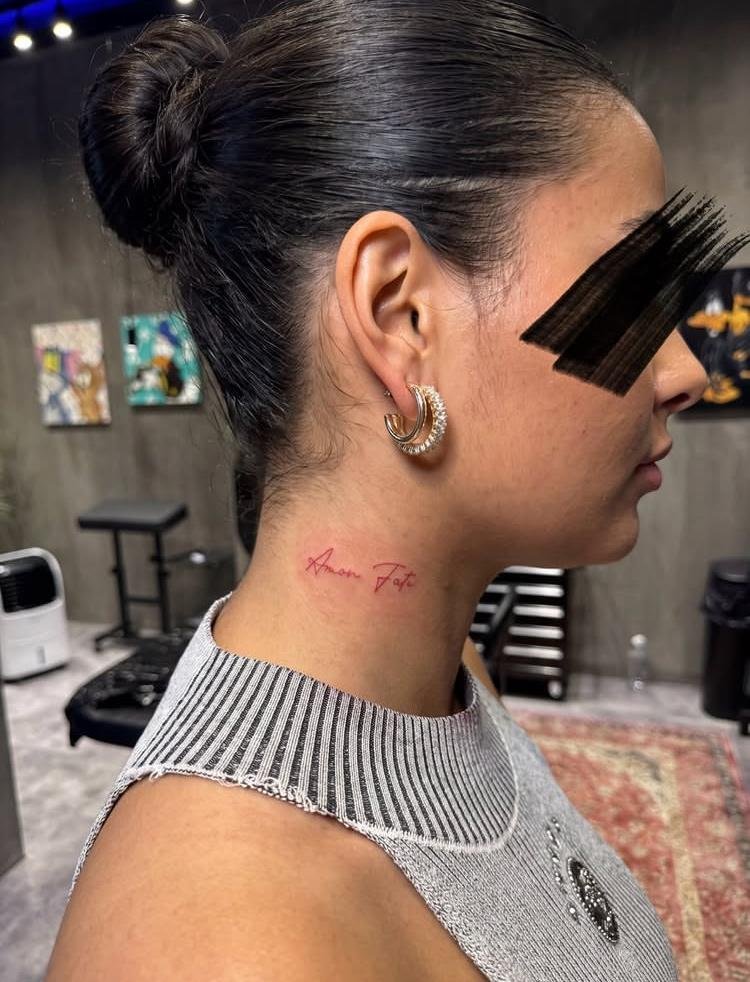
A slim red script treatment makes the Latin phrase feel quiet but visible. The neck gives it a direct, personal presence, so consider how often you want the tattoo seen at work, in photos, or with different clothing. You can use lowercase lettering for a softer look or capitals for more contrast.
Ask the artist to test the words as a stencil before choosing the final size. Script can lose clarity when strokes are too tight, especially on a narrow area. Check every letter and the space between the two words before approving the design.
If you choose the neck, decide whether you want the words aligned with the jaw, hairline, or shoulder. That small shift changes visibility and the way the phrase reads. A custom stencil lets you compare these options before the artist begins.
2. A Feather With a Touch of Color
A feather can add movement to the words without turning the tattoo into a large illustration. It may connect to a personal memory, a favorite bird, or simply the way the phrase makes you think about moving through life. Keep the color limited to one small detail for a balanced result.
Feather tattoos carry different associations for different people, so choose the image for a reason that belongs to you. If you want the phrase to remain the focus, place the feather beside it rather than weaving it through every letter.
Keep the feather from crossing the Latin words unless you are sure the linework will remain clear. You could place it as a small emblem at the end of the phrase or use only one colored bar to create the accent.

3. Bold Gothic Lettering Across the Fingers
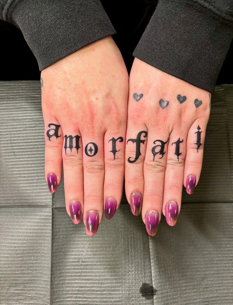
Gothic capitals create a strong, high-contrast look that fits the phrase’s serious tone. Finger lettering can make each word or letter visible as a statement, but it also puts the text on a small, highly exposed area. Consider how the design looks with your hands relaxed and in motion.
Ask an experienced tattooer whether the exact placement and letter size will suit the word length. The skin on hands is exposed to frequent washing and movement, so discuss the studio’s expectations for healing and possible touch-ups. Do not shrink the letters just to force the phrase onto a narrow space.
Before selecting a finger, test how the word sits when your hand is relaxed, bent, and open. Ask the artist to explain the limits of the area and likely maintenance. A more spacious placement can preserve the lettering if the fingers feel too narrow.
4. Tiny Words Along a Finger
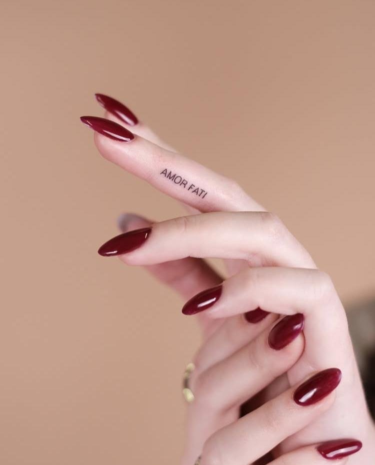
A compact version may appeal if you want the phrase close at hand without a large composition. The words can sit along the side of one finger or be divided across two placements. Before choosing a miniature size, decide whether you need both words to be readable from a normal distance.
Fine lettering has limited room for open shapes. Ask to see the stencil at its true size and compare a few placements before selecting one. If the letters look cramped, use a shorter symbol beside the phrase or move the words to a wider part of the body.
Finger placements can be seen from different angles, so ask for a mirror check and a photo of the stencil. This helps you catch reversed direction, uneven spacing, or letters that appear too close to a joint before the design becomes permanent.
5. Red Lettering With Ornamental Florals
Red lettering framed by leaves or flowers gives the phrase a more decorative look. You could choose a small botanical detail from a garden you remember or a simple border that follows the natural curve of the lettering. Keep the leaves secondary so the Latin text remains easy to read.
Color can look different on individual skin tones and after healing. Ask your artist to explain how the shade may appear and show healed examples in a similar palette. If the lettering is the central element, avoid placing petals over letters or squeezing the words between dense stems.
Consider using red only for one flower or underline while keeping the phrase in black. That contrast can make the text easier to scan. A restrained palette also keeps the overall design readable when it is viewed from a few steps away.

6. A Little Pink Flower of Acceptance
A small pink bloom can soften a compact phrase tattoo. It may stand for a personal memory, a favorite flower, or simply a color you enjoy; there is no universal meaning attached to every pink flower. The minimalist composition works well when you want one visual accent instead of a full scene.
Choose whether the flower should sit above, beside, or below the words. A clean gap between image and script helps the two elements stay distinct. Ask the tattooer to simplify the petals if their outlines become too fine at the size you prefer.
The flower can be a bud, outline, or small filled shape depending on the style. If it is based on a real plant, bring a reference photo so the artist understands the petals and leaves you want, rather than improvising a generic blossom.

7. Oversized Calligraphy Along the Ribs
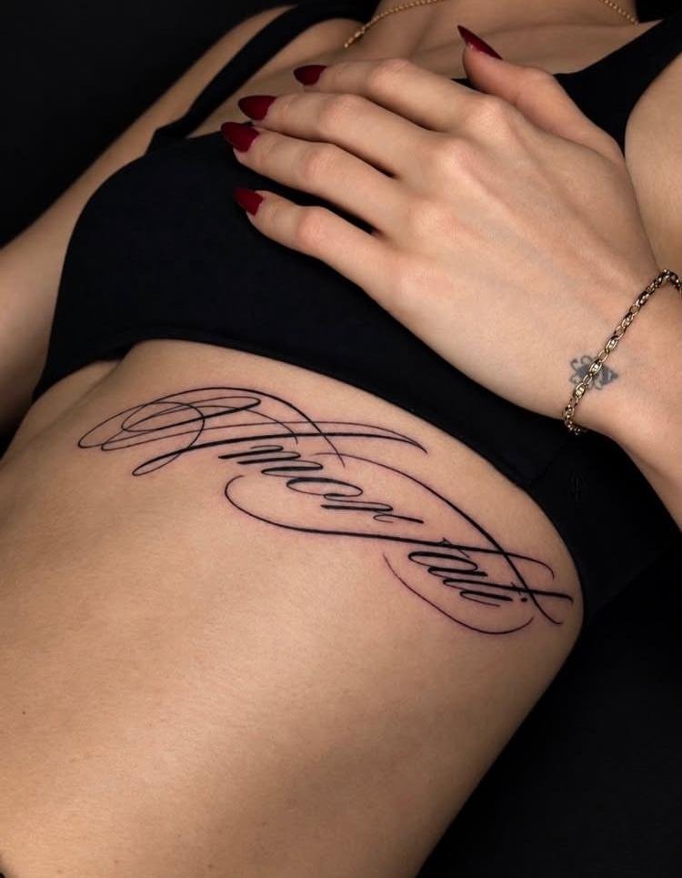
Large calligraphy gives the letters room to curve and lets the phrase follow the side of the torso. This placement is more private under most clothing, though it becomes visible with some outfits. A broader design can include a longer flourish while keeping the wording legible.
Ask to see the stencil while standing naturally and breathing comfortably. The torso moves, so the lettering should still read when your body is relaxed. Consider the full length of the phrase and whether you want the initial letters or a small symbol to anchor one end.
A larger script line can be easier to read than a delicate miniature phrase. Ask the artist to measure the available area and show where the letters will begin and end. You can also shorten flourishes if the design needs to fit comfortably.
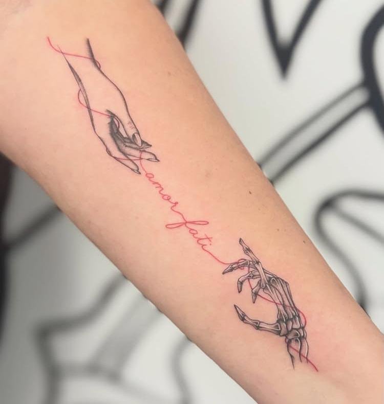
8. A Red Thread Between Life and Death
A thread motif can connect the phrase to the way you understand change, loss, or continuity. The red line might pass through a small circle, cross a flower, or link two simple shapes. Treat it as your personal interpretation rather than a fixed symbol with one accepted meaning.
The phrase does not mean that every painful event should be welcomed or that someone must tolerate harm. If this design reflects a difficult period, choose a symbol that acknowledges your experience without minimizing it. A tattoo can remind you of how you interpret the idea now.
The thread can take a gentle path through the composition or remain separate as a frame. Avoid drawing it as a literal boundary between “good” and “bad” experiences unless that is your intended meaning. The words and image should reflect how you personally understand the phrase.
9. Butterfly Wings and Classic Lettering
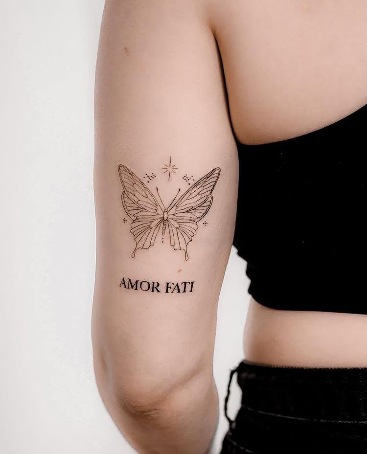
Butterfly wings can frame the words or form a small emblem above them. This design combines a familiar symbol of change with an expression often connected to life affirmation. You do not have to present the butterfly as a direct translation of the phrase; it can simply be an image that fits your own story.
Detailed wing patterns need space to stay clear. Ask the artist which markings should remain and which can be removed. If the tattoo is small, a clean outline with one or two interior lines can hold its shape better than a dense set of spots and veins.
Butterfly species have different shapes, so choose one for its appearance or personal connection. A simple side view can work beside a line of text, while open wings may need more width. Bring a reference that shows the wing shape clearly.
10. Dark Surrealism Meets Gothic Lettering
Surreal imagery and Gothic text can create a more intense, personal design. Use a single figure, shadow, or abstract shape to suggest the experience behind the phrase rather than adding unrelated dark symbols. This style can suit a larger placement where the composition has room to develop.
Surreal art can become hard to interpret when too many elements compete. Tell the artist the central idea in plain words and choose one focal point. Review the design as a tattoo stencil, not only as a detailed digital illustration, and ask what details may need to be simplified.
Use negative space to give the darker illustration a clear focal point. Ask the artist which shadowed shapes will still read once they are tattooed at the intended size. If you want the phrase visible, keep it outside the deepest parts of the image.

11. Flowing Calligraphy Along the Foot
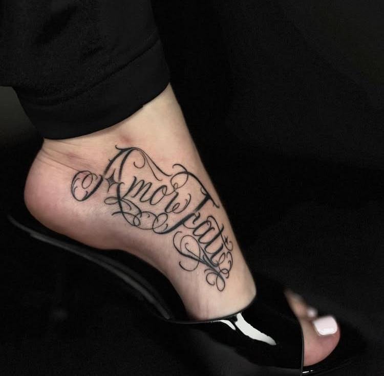
A calligraphic phrase can follow the curve of the top or side of the foot. This placement keeps the design personal while allowing it to show with certain shoes or clothing. A flourish can echo the foot’s shape, but it should not crowd the phrase or make the words difficult to follow.
Foot placement is exposed to footwear and daily movement, so discuss healing and aftercare with your tattooer before booking. Try the stencil with your usual standing posture and check that the letters do not stretch awkwardly over a curve or joint.
Footwear and socks can cover or rub against a design, so talk over the exact location with the studio. A stencil can show whether the calligraphy will sit in a flat area or cross a joint. The artist can recommend a layout that suits your routine.
12. A Little Sunshine and Moonlight
A sun and crescent can sit beside the phrase as a small contrast of light and dark. They can represent time, cycles, or a personal memory, but there is no single definition you need to follow. Keep the symbols modest if the words are the main reason for the tattoo.
Decide whether the sun and moon should match in size or balance each other through different shapes. A few rays or stars may be enough. Ask the artist to leave negative space between the symbols and the lettering so each part remains recognizable.
A sun and moon can stay very small, or become the main image with the words set below. Decide which feature should lead before adding stars and extra lines. Leaving open space around both symbols often makes the full design easier to understand.

13. Statement Calligraphy Across the Hand
Hand calligraphy makes the words highly visible and gives a long phrase space to flow across the skin. It can be a confident choice if you are comfortable with a prominent tattoo. A single accent line or small emblem may be all the decoration the design needs.
Hand tattoos can be affected by exposure and frequent use; talk with an experienced artist about the specific area and maintenance before deciding. Check the spelling, direction, and letter spacing on the stencil with your hand in a natural position. Make sure the design does not cross a fold in a way that distorts the text.
Hand placement makes the spelling visible to you and to other people. Choose whether you want the phrase oriented for your own view or for someone facing you, and confirm that direction on the stencil. Do not assume the artist will guess your preference.

14. A Secret Message Behind the Ear
A small script tattoo behind the ear offers a more discreet interpretation of the phrase. It can be hidden by hair or shown with a shorter hairstyle. The compact placement works best when you keep the words simple and avoid extra artwork that competes for space.
Ask the artist to show you how much of the phrase can fit clearly in the chosen area. Fine curls and miniature flourishes may be hard to distinguish, so a clean font can be a better fit. Verify the lettering in a mirror before the stencil is approved.
Behind-ear tattoos are easy to hide, but the curved area can limit how many letters fit. Try the stencil with your hair up and down, and check it from a side view. This can help you decide whether the phrase should be smaller or moved nearby.

15. Flowing Script With a Little Bird
A small bird alongside the words adds a sense of direction or motion. You might choose a species that connects to a place, a family story, or an outdoor memory. The phrase can remain in a simple font while the bird provides the more expressive part of the design.
Choose a bird pose that fits the composition and does not make the words look like an afterthought. If the artwork is small, use a clear silhouette rather than fine feather details. Ask the artist to balance the bird and text at the actual size.
Birds can suggest flight, migration, or a personal memory, but the tattoo does not need to make a philosophical claim. A small silhouette beside carefully set type can feel balanced. Let the artist use the bird as a visual accent, not a replacement for the phrase.

16. Vintage-Inspired Lettering on the Thigh
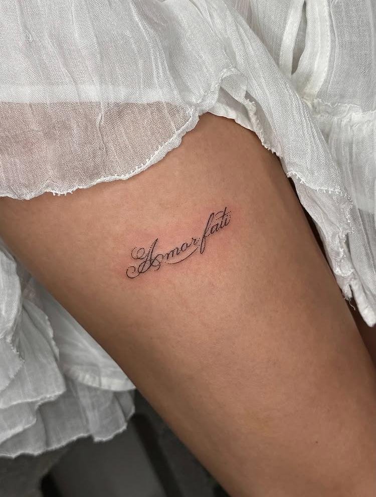
A vintage font on the thigh can make the Latin phrase feel like a label, book inscription, or old keepsake. The larger area gives room for a border or small decorative marks. It is also easy to keep the tattoo covered when you want a more private placement.
Bring a few type references that show the mood you want, not just a font name. Check whether the artist can reproduce the letterforms clearly and make the phrase readable. If you add ornament, leave enough space around the words so the design does not become a dense block.
The thigh gives room to use larger letterforms and a border, but the tattoo can remain private under clothes. If you add a vintage frame, make sure its lines are not so close that they merge with the letters. A simple frame can provide enough structure.
17. Elegant Calligraphy Across the Shoulder Blade
A shoulder-blade placement can hold a flowing line of script while staying easy to cover. The phrase can run horizontally or follow a gentle curve. A small flourish at either end may complete the design without taking attention away from the words.
Check the stencil with your arms relaxed and raised, since shoulder movement can change how the text sits. Ask someone you trust to look at the spelling and spacing from a normal viewing distance. A slightly larger design can preserve the delicate character better than very tiny script.
Ask the artist to trace the shoulder curve on the stencil rather than forcing a straight line across it. The phrase should look balanced from behind and from the side. A slightly arched baseline may follow the body more comfortably than a rigid horizontal row.

18. Little Figures Dancing Under the Sun
Small dancing figures can suggest a personal image of accepting life with energy and movement. They might represent you at different points in time or simply give the phrase a joyful contrast. You can choose abstract silhouettes so the composition feels personal without looking like a portrait.
Give the figures enough room to read as people rather than dots. A simple pose, a sun, and the phrase may be enough to tell the story. Ask your artist to test the design on paper at the intended size before choosing the final placement.
The little figures can be abstract shapes rather than detailed people. You might use simple poses, a ground line, and a sun to suggest movement. This keeps the tattoo about a feeling or personal memory instead of making a claim about Nietzsche’s full philosophy.

19. Typewriter Lettering With a Colorful Twist
Typewriter-style letters give the phrase an editorial or journal-like feel. A single colored mark, such as a small flower or line, can keep the design from feeling too rigid. This option works for people who want the text itself to be the main image.
Check the spacing and punctuation carefully because typewriter lettering uses consistent character widths. Decide whether you want the words in lowercase, title case, or all caps, then review the exact proof. Keep the color detail small enough that it supports rather than interrupts the phrase.
Typewriter fonts often include tight punctuation and distinctive lowercase forms. Check the small letters in the proof, especially the “a” and “i,” and make sure the spacing is even. A color accent can sit above or below the text instead of inside it.

20. A Butterfly Drawn in One Flowing Line
A continuous-line butterfly can create a light symbol beside the Latin text. The line can move from one wing into a small flourish, giving the artwork a hand-drawn quality. Choose this if you like an airy design with generous open skin around it.
Ask the artist to keep the line path simple and avoid crossings that make the butterfly hard to recognize. If you want the phrase in the same stroke, test whether the lettering stays readable. A separate image and text may create a cleaner result.
The one-line butterfly can be more recognizable if the wings are not reduced to a single loop. Ask the artist to create a clear silhouette first, then add the flowing stroke. That order can keep the idea readable even if some decorative linework is removed.

21. A Pink Rose With Flowing Script
A rose beside the words can add softness and shape. You might choose a rose because it has a personal association, or because it fits the style you want. The design can be romantic, minimal, or more detailed depending on how much room you have.
Roses are common tattoo imagery, so consider one specific feature that makes this version yours: a particular stem, a bud, a small leaf, or an unusual angle. Ask the artist to keep the lettering separate from the petals and to show the design in a healed-work portfolio.
Choose the rose angle and petal count based on the space available. A single stem beside the phrase can be more balanced than a full bouquet. If color matters, discuss how the rose will coordinate with the text rather than choosing a shade from a screen alone.

22. A Little Heart Above the Words
A small heart above the phrase keeps the composition direct and easy to adapt. It can be solid, outlined, or formed from two simple curves. If you prefer a subtle tattoo, use the heart as a tiny accent and let the Latin phrase carry the meaning.
The heart does not need to mean romantic love; it can stand for care, life, or a personal reminder. Choose the meaning you want. Keep the heart proportional to the words so it does not dominate the design or look disconnected.
Place the heart above the phrase with enough breathing room so it does not look like punctuation. You can use an open outline for a light appearance or a solid shape for more contrast. Let the artist compare both options at the exact size.

23. Fine-Line Florals Woven Into the Lettering
A few fine-line stems can weave around or beneath the phrase for a softer botanical look. This is a good way to combine text with a favorite plant without building a full floral wreath. Let one stem cross the composition lightly rather than wrapping around every letter.
Make sure the flowers do not interrupt the words. Ask the tattooer to identify the most important parts of the lettering and preserve clear gaps around them. If the stems are too thin or numerous, remove some lines and give the remaining ones more room.
Fine-line leaves can frame a short phrase, but they may become visually busy around long calligraphy. Ask the tattooer to identify the clearest path for each stem. Separating the foliage from the letters can keep both the botanical detail and the Latin words distinct.
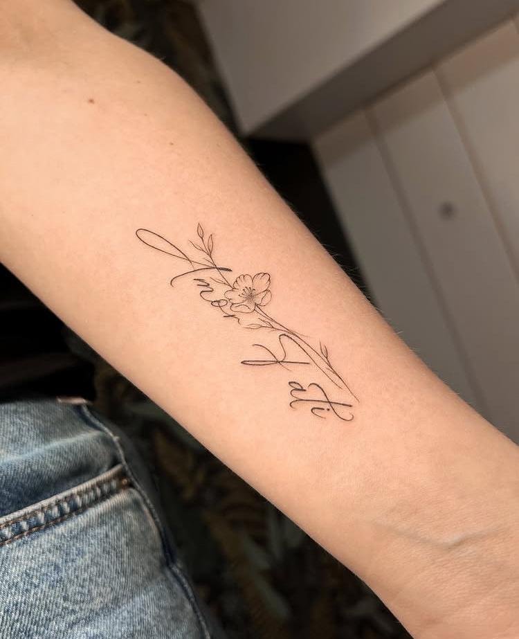
24. A Floral Touch Beneath the Collarbone
A small floral design below the collarbone can keep the phrase visible but easy to cover. One bloom or a short branch may balance the script without making it too ornamental. The placement follows a natural horizontal line, which can work well for two short words.
Test the design with clothing that matches what you usually wear. Ask how the lettering will sit when you turn or lift your arm, and ensure the flower does not crowd the word spacing. A custom sketch can follow your anatomy instead of copying a flat reference image.
Collarbone placement can follow the body’s line, but the stencil may shift as you move. Check it with your shoulders relaxed and your head in a natural position. Choose a length that fits comfortably instead of extending the phrase to fill every inch.

25. A Fierce Snake With Gothic Lettering
A snake can bring an intense edge to Gothic text. It may curve around a small emblem or frame the phrase without covering it. Choose the image for a reason that makes sense to you; snakes carry many interpretations across cultures and stories.
If a particular snake symbol has religious or cultural meaning, learn about that context before adopting it. For the artwork, make sure the head, body, and words remain distinct at the intended size. A bold silhouette may read more clearly than packed scales and shadows.
If you are drawn to the snake for a specific cultural or religious reason, research the symbol in that tradition rather than relying on a generic tattoo meaning list. For a purely visual design, focus on its shape and how it frames the words without hiding them.

How to Choose a Style and Font
Start by writing the exact phrase on paper in the capitalization and punctuation you want. “Amor fati” is usually written as two words, with no accent mark. If you want to use a quotation, verify the source and translation rather than copying a graphic that may have spelling errors. A tattoo artist can help refine the lettering, but you should confirm the wording before the stencil is applied.
- Match the type to the message. Serif lettering can feel literary, script can look personal, and Gothic lettering can appear more forceful. Choose a style you will still enjoy apart from the trend.
- Use images with a reason. Flowers, birds, butterflies, and celestial symbols can personalize the phrase, but their meaning is not universal. Pick one that connects to your own experience.
- Keep the composition readable. Decide whether the words or the image should stand out first. Leave space around letters and avoid adding details that crowd the phrase.
- Work with an artist’s original drawing. Save references to describe your direction, then ask for a custom layout sized for your body and preferred placement.
Placement and Legibility
Placement changes how a text tattoo is seen and how much room the artist has for the letters. A hand or finger is highly visible and narrow; a thigh, rib, or shoulder blade offers more space and can be covered more easily. There is no universally best spot. Think about your daily routines, clothing, and comfort with visibility.
Review the stencil in your natural posture and from a normal viewing distance. Check the phrase’s direction, letter spacing, and how it follows a curve. If the design looks crowded, consider a wider placement or a simpler font instead of reducing every letter.
Tattoo Safety and Care
Choosing a clean, regulated studio matters because the tattoo process breaks the skin. The FDA says contaminated inks can cause infections and that some people experience reactions to tattoo inks. Review the agency’s tattoo safety guidance and check local health requirements before booking. Follow your artist’s aftercare instructions and contact a health professional if you are concerned about a reaction.
Once your tattoo is healed, sun protection can help keep exposed ink from fading. The American Academy of Dermatology explains that UV light can fade some tattoo inks in its tattooed-skin care guide.
FAQs About Amor Fati Tattoos
What does an amor fati tattoo mean?
It usually refers to “love of fate,” a phrase associated with Nietzsche. A person may use it to mark acceptance, life affirmation, or a specific period in their story. The wearer’s reason matters; the tattoo does not carry one meaning for everyone.
Is amor fati a Stoic phrase?
The phrase is strongly associated with Nietzsche. Modern readers sometimes discuss it alongside Stoic ideas, but it is more accurate to describe it as Nietzsche’s phrase and avoid treating it as a direct ancient Stoic quotation.
What is a good symbol to pair with amor fati?
There is no required symbol. A flower, bird, butterfly, sun, moon, or abstract line can accompany the words if it represents something personal. Choose the image for your own reason instead of relying on a universal meaning chart.
Where should I place an amor fati tattoo?
The wrist, forearm, shoulder blade, ribs, thigh, hand, and foot are all possibilities, depending on size and visibility. Ask the artist to test a full-size stencil and make sure the lettering fits the area clearly.
Should the phrase be written as “amor fati” or “Amor Fati”?
Both capitalization choices are stylistic. The Latin phrase is commonly written in lowercase in philosophical text, while title case can suit a tattoo design. Check the exact letters and spacing on the stencil before the session.
An amor fati tattoo can be understated or dramatic, but its strongest detail is the meaning you choose to carry. Take time to confirm the wording, find an artist whose healed lettering you trust, and make sure the design remains clear at its final size. For other thoughtful tattoo inspiration, see our mom tattoo ideas and dandelion tattoo designs.